- Q: What do you do? A: I program and design.
-
Q: What is the spirit/personality of you? A: I am a very straight forward and logical worker – I look for the most efficient and effective ways to get from A to B.
- Q: What is your target market, client base? A: I would prefer to work in a bigger corporation with a wide range of target market variety.
After answering these questions and spending multiple weeks brainstorming and designing my company brand, I concluded with the following structure: My company name is Logicode, which was inspired by the mixture of "logic" and "code" into one word, where both of these words describe me and were used in my answers for the research phase.
The main color for my logo is red, which was chosen to represent commitment, energy, and courage - the common traits given to the color red. Apart from the clean, crisp line quality, aligned and balanced font used for the logo, the three rings above the "i" represent a bulls-eye, as a metaphor for precision. This metaphor is better visualized in the animated logo.
The main color for my logo is red, which was chosen to represent commitment, energy, and courage - the common traits given to the color red. Apart from the clean, crisp line quality, aligned and balanced font used for the logo, the three rings above the "i" represent a bulls-eye, as a metaphor for precision. This metaphor is better visualized in the animated logo.
Here is the animated logo:
Here are the remaining required pieces created for my company:
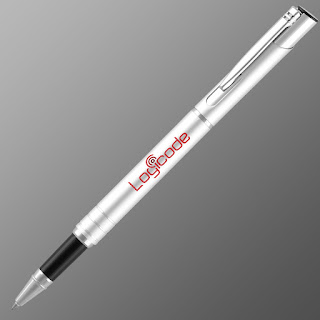
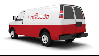
For my additional marketing pieces, I created a mock-up of a pen with the company logo, and a company-styled branded van. The pen compliments the business by further improving the brand, as more people who are exposed it begin to recognize or question the company itself. The pen can also be given out like a business card to grow the company. The van is simply an advertising object, which once again, makes the brand, the company, and the vivid colors more recognizable.


Comments
Post a Comment